Home > Music
Designing the cover of BTS’ ‘Map of the Soul: Persona’
By Ahn Sung-mi


 |
| CFC founder and creative director Charry Jeon |
For Charry Jeon, founder and creative director at CFC, the Seoul-based design studio that orchestrated the visuals for BTS’ latest chart-topping album, the project was all about love.
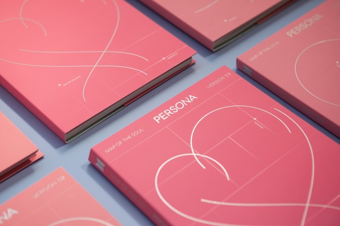
“The ‘Persona’ album talks about love,” Jeon told The Korea Herald in a recent interview. “Intuitively, the color pink came into my mind, which expresses a pit-a-patting heart and excitement.”
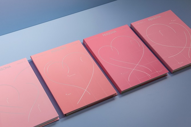
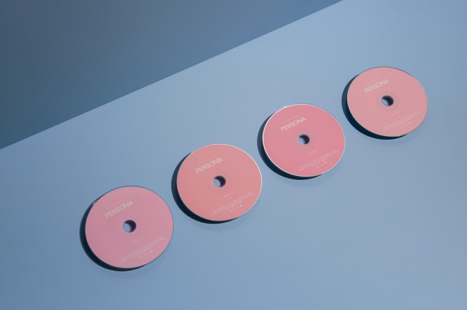
She used different shades of pink for four versions of the album cover.
“Just like there are various textures of love, I thought the variations of pink could portray the album’s mood better,” she said.
The central feature of the simple yet symbol-rich album cover is a heart, which captures the joy of love with graceful, flowing silver lines. The transparent, variable grid that appears in the background illustrates the “map” concept -- the central theme of the album -- with markers identifying the version and the album title on the map.
“With the map and heart, I tried to depict the trajectory of love,” she explained.
 |
 |
| BTS’ “Map of the Soul: Persona” visual identity (CFC) |
“We contemplated long on how to put together these themes in a simple form, while expressing BTS’ identity through this album.”
To do so, the designers at CFC listened to BTS music and watched music videos, visuals and clips to understand the band and its music style. “We all became fans,” she said.
“It was important to come up with design that was in accordance with BTS’ own identity,” she said. “There is a certain tone and manner that Big Hit Entertainment and BTS have kept throughout their music career and discography. The new album has to harmonize with the previous ones as well.”
 |
| BTS’ “Map of the Soul: Persona” visual identity (CFC) |
She admitted there had been pressure when she undertook this project because it was CFC’s first time designing an album cover, in addition to the pressure of having to meet such high expectations from a watchful public. But once the album was out, she was glad the agency, as well as many fans, liked the simple and elegant design.
Reflecting on previous projects, Jeon said working with S.M. Entertainment last year to design its new corporate identity was an exciting task.
“S.M. Entertainment is very interested in culture and technology, just like its slogan, ‘the future of culture technology,’ suggests,” she said. “The company wanted to deliver the convergence of the two and the theme of continuously changing and revolutionizing. They were very open to changes, even drastic ones, without limitations on design.”
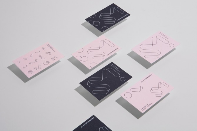 |
| S.M. Entertainment visual identity (CFC) |
The 6-year-old firm, which focuses on branding and packaging, is one of the most promising studios in the industry, with big-name clients like Kia Motors and Hyundai Department Store.
Jeon emphasized that CFC is cross-sector when it comes to design. “We are open to exploring different areas,” she said. “I think working with different industries can be an inspiration for others. While it seems different, new and fresh designs can be created from diverse experiences.”
Whether the client is a carmaker, a coffee shop, a beauty brand or an entertainment agency, the most important aspect is to identify its core values, she explained. “We are not the protagonist. It’s more important to display the client’s core identity, by working closely together, and come up with a design that is in line with the brand.”
By Ahn Sung-mi (sahn@heraldcorp.com)