K-pop light sticks explained: BTS, Apink, GOT7, Mamamoo


In K-pop culture, a light stick is so much more than a glow stick for concerts.
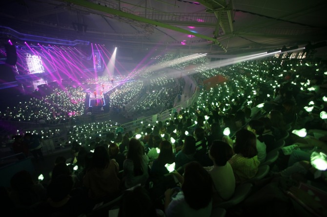
While it is a practical item to have in dark concert venues, light sticks act more like a symbol of fans’ unity and strength.
It enables artists to look out into a crowd and see a sea of their trademark color being emitted from light sticks they have created.
Although they typically have the same purpose, artists put in the effort to add a special twist to their light sticks, whether it be using a specific color, type of aesthetic, or certain shape.
Here are some of the light sticks that have become popular among fans:
1. BTS
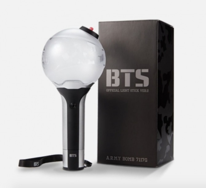
The group’s first light stick was released on its fan site in 2015, two years after its debut.
A gray bomb atop a simple black stand, the design is simple and bold. The sphere is thought to symbolize a globe, representing the group’s growing international popularity. In 2017, a second edition of the light stick was released with a more translucent sheen, refined tip, and sleeker stand.
On July 5, a teaser for the third version of the light stick was shared with fans, featuring a similar concept in a darker tone.
 |
| (Big Hit Entertainment) |
 |
| (Big Hit Entertainment) |
2. Apink
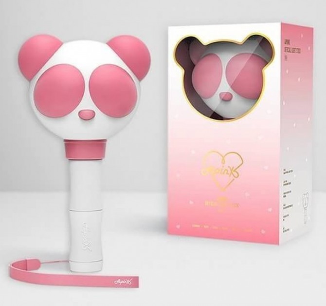
On the other side of the creative spectrum, Apink designed a panda with pink accents to be the center of its first light stick in 2016.
It represents the girls’ fan base name, Panda, and official color, strawberry pink. When turned on, the panda’s nose, eyes, and ears light up.
Apink released the design for the second version of its light stick this year. While it won’t look distinctly different from the current version, it will incorporate features like lighting systems that can be controlled remotely.
 |
| (Plan A Entertainment) |
 |
| (Plan A Entertainment) |
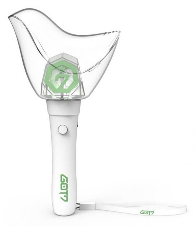
3. GOT7
Similar to Apink, the seven-member boy brand used its fan base name, IGOT7, as inspiration for their light stick.
Because IGOT7 sounds like “baby bird” in Korean, the 2016 light stick features a clear bird encasing a neon green GOT7 logo on top of a white stand.
The group released a second version of the light stick in preparation for their 2018 world tour as well. Again, the general idea is the same, but a muted green color with a more geometric bird shape are implemented as improvements.
 |
| (JYP Entertainment) |
 |
| (JYP Entertainment) |
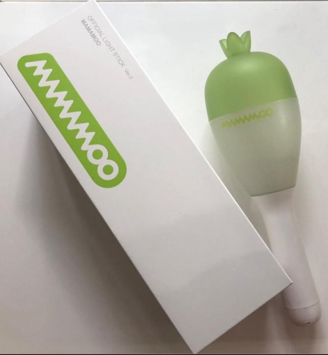
4. Mamamoo
Perhaps the most playful of designs, Mamamoo has used a radish shape for its light stick because “moo” in Korean translates to radish in English.
Similar to the shape of a maraca, the first version from 2015 was white and green, complete with an adornment acting as a radish top.
Mamamoo announced its second light stick in 2017, which has mostly internal improvements. The biggest being that with the new version, users have the option of 256 colors, along with the ability to make it vibrate.
 |
| (RBW Entertainment) |
 |
| (RBW Entertainment) |
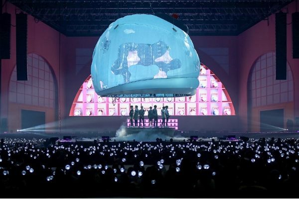
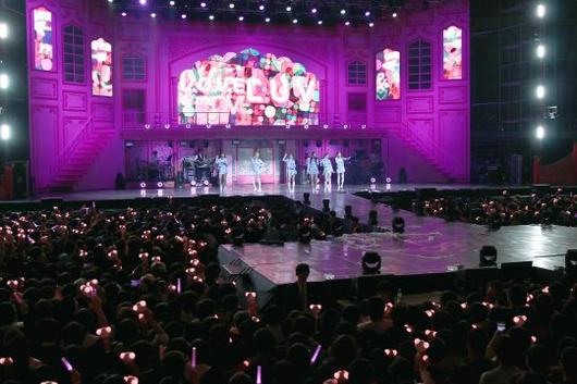
Light sticks may seem like a small part of the K-pop industry, but to fans, they are quite a big deal. People often anxiously wait for announcements on the release of new light sticks and go through the trouble of preordering.
These products have become so popular that they often sell out, and in some cases, there is a cap on the number that can be purchased per order.
As much as fans dedicate themselves to attaining these light sticks, artists themselves also pay attention to every detail of the design, an explanation as to why new versions of the light sticks are created so frequently.
By Serena Soh, Intern reporter (sjsoh@heraldcorp.com)